Hey Dolls...it's been a while
Sunday, 26 October 2014

I still haven't fully recovered my drawing streak, but I'm trying to work on some longer projects for now, and so I probably won't be posting as often as I'd like.
This week I do actually have some exciting news however! I found some internship opportunities and I was asked to be a featured artist on a web summit for illustration that's happening in Dublin next month. So I'm pretty stoked about that.
In other news, I still don't know quite what to do with my little chinese dolls. So I made them into stuff. I was pretty pleased with the results...so pleased, I decided to treat myself to an iPhone sticker with my dolls. My flatmate also decided to get in on the fun and ordered one of my stickers for the back of her iPad. I'm so excited to see what they look like on. Come on, mail!
There's just something about seeing something you made actually on something that's so much fun. (If you're feeling fancy, you can find them in my online shop here.) In the meantime, here are my dolls on stuff that I think is pretty cool :)
This is an iPhone5 sticker that I bought for myself. They're super strong and resilient. The Tenochtitlan Sunset print I had made for my mac is still fresh and lovely after 6 months of being jammed into my bag every where I go -and it doesn't break as easily as a case - so for me the sticker is a winner.
Animals (動物) and Dolls 娃娃
Sunday, 12 October 2014
The Dragon King/Broken External Drive.
Tuesday, 26 August 2014
Lately, I feel a shift in my style and focus happening almost automatically. I have started to fall in love with flatter perspectives and...**shudder** a more animé approach to linework.
I'm trying to work on my first real book. I've been approached to make a book app but I don't know if that will lead anywhere yet, so in the meantime, I've decided to start drawing roughs just in my own time, and let the style be dictated by its own development.
Also, I smashed my hard-drive, so all of my originals of the prints I created over the past year (and the lion's share of my portfolio) may or may not be lost forever....hence the lack of nice things to post on my blog that I'd been working on over the summer :( I had to download this picture from my own Facebook page (you can like and follow me here!). Oh well, fingers crossed for the outrageously expensive data recovery to work!
The working title is Sassa and The Dragon King, after a little girl that I used to teach who really loved the white rabbit I brought in to show her one day :)
 |
| Chinese Dragons are undoubtedly the coolest ones. |
Fruity Cassettes
Wednesday, 25 June 2014
I had an idea (which happens sometimes in the middle of something entirely different that you're supposed to be doing) and I wanted to explore it right away. I wanted to do retro cassette tapes (because who doesn't love those awesome shapes?). As fruit (because who doesn't love the colours of watermelon?). And this little project was born.
 |
| Fruity Cassettes |
I don't know where it's going yet. I only have a vague inclination in my mind where I would like it to end up. It is crying out for texture, so I'll probably add that next.
 |
| Cassettes type two |
Labels:
1980s,
bright,
Cassette,
cassette tape,
cheerful,
colour,
fruit,
Illustration,
Illustrator,
retro,
strawberry,
summer,
vector,
watermelon,
wood
Love Bug
Sunday, 22 June 2014
Today I have a sweet ride. Check out my little pink Love Bug! So much fun to draw. I seem to have returned to vectoring almost exclusively, while my poor unloved Cintiq sits gathering dust in the corner. Soon, my love. Soon.
 |
| Love Bug |
Labels:
Car,
Character Design,
Cute,
hearts,
Illustration,
love,
retro,
vintage,
Wheels
The Lady loves Pearls! - Character Design
Thursday, 5 June 2014
So I had a pretty rough couple weeks, with moving, people-drama and other things. And I didn't get to draw too much. It's only been a recent thing that I've been drawing like the clappers (I decided to throw out all of my old portfolio work and start afresh), but once I stopped, I really missed it.
So here is just something small and simple that I worked on a few days ago. A lady who loves her jewels :)
So here is just something small and simple that I worked on a few days ago. A lady who loves her jewels :)
Labels:
Character Design,
Design,
Illustration,
Illustrator,
Lady,
Line-work,
People,
Visual Development
More Chinese Opera Masks
Saturday, 17 May 2014
This is a project that keeps growing. It's rare for something to hold my interest long enough to develop it over a series, but I just find Chinese traditional costumes and architecture and culture too gorgeous to resist. I had so much fun doing these. More soon!
Labels:
Beauty,
Chinese,
Chinese Culture,
Chinese Opera,
Costume,
Hong Kong,
Opera Masks
Signs and Stickers
Sunday, 27 April 2014
This week, I didn't get a whole lot of drawing done. For whatever reason, I just wasn't feeling very productive. But it wasn't for lack of inspiration - I have some of my best ideas while I'm on the commute to work in rickety old mini-bus climbing one of HK's hills at 80 km an hour.
'
I have been thinking about doing something with signage for a while now. Hong Kong is full of it. You don't have to look very far to find something quirky or quaint, and the signs are an amazing hodgepodge of old and new. Neon strobes here. Traditional hand-lettering there. Everywhere, juxtaposed against each other, fighting for space. So I decided to make some surface patterns, just because I hadn't really done one before, and I wanted to try it out. I had the idea in my head, but I wasn't exactly clear on how I was going to execute it. Big mistake.
After having spent hours on the lettering (I did most of it by hand), I realised that I might as well just not have bothered. It was boring, and corporate. I mean, it was fine. But it just wasn't me. So after half-heartedly posting it up I had to pull the listing down again. I feel like I lost my creative voice on this project, trying too hard to make things look 'just so', and I forgot to make it fun, like my other work.
The next attempt was a little better, but I still really didn't like it. You would never have thought that I spent hours making the lettering by hand. And now that I'm looking at it, I kind of have to wonder what the point was, when it just looks like an anonymous font from a word-processor. Hmm.
Just so it won't be a complete waste (and because I don't believe in only learning from successes), I'm going to post them here, as a 'work-in-progress.' Hopefully, if and when I do attempt the subject matter again, it will look a million times better.
I can't wait to punch this project up a notch and make into one of my best. But for now, here is the scaffolding. Have a happy weekend!
Mini update…Chinese Opera!
Tuesday, 22 April 2014
It seems to me that 2014 is going to be a year of obsessing over things that I just HAVE to draw. I haven't been this prolific in a long time, despite working full-time and having a crazy commute to and from work.
My latest thing is Chinese opera. It's taken me a while to get to know Hong Kong properly, and I think for the first time I can say that I do love it. It is a very exciting and interesting city to live in, and I will be sad to say goodbye whenever I do leave. There's so much colour, everywhere! And reference materials all right there on my doorstep. Temples, pagodas, markets, ponds, koi, parks, boats, statues…I'm realising how much I do want to study and accomplish before I move on, so I know that I've made the best of this amazing opportunity to gather my thoughts and get my work together.
I don't really have much to show yet, but I drew these guys up last night and I was so pleased with them I just wanted to share them. They're not exact or even close adaptations of actual masks - I wanted to explore with colour and shapes so I put my own spin on them instead. I really like the idea of doing a series and I want to see if I can make some full-blown illustrations based on the performers themselves (along with the huge list of things I've already decided to draw).
Hopefully I'll have more to post up soon :D
Oldies but Goodies…
Sunday, 20 April 2014
Wow it's been a couple weeks already since I've posted and I have no idea how that happened. Well, maybe. There's this post by Aminder Dhaliwal. I find her comics hilarious :D Yet another happy example of how my extreme super-sleuthery portfolio huntingness has been useful (thank you, Twitter).
So I'm still working on that top-super-incredibly-fanstastically-super-duper-wooper secret project that I can't talk about yet in case I jinx it. Let's just say it's not my first one, but I hope it'll be my first actually completed one. And it may or may not rhyme with 'look.' But that's it! That's all you'll get out of me. I am the Dobby of Secret-keeping. Wait. That probably wasn't a great example.
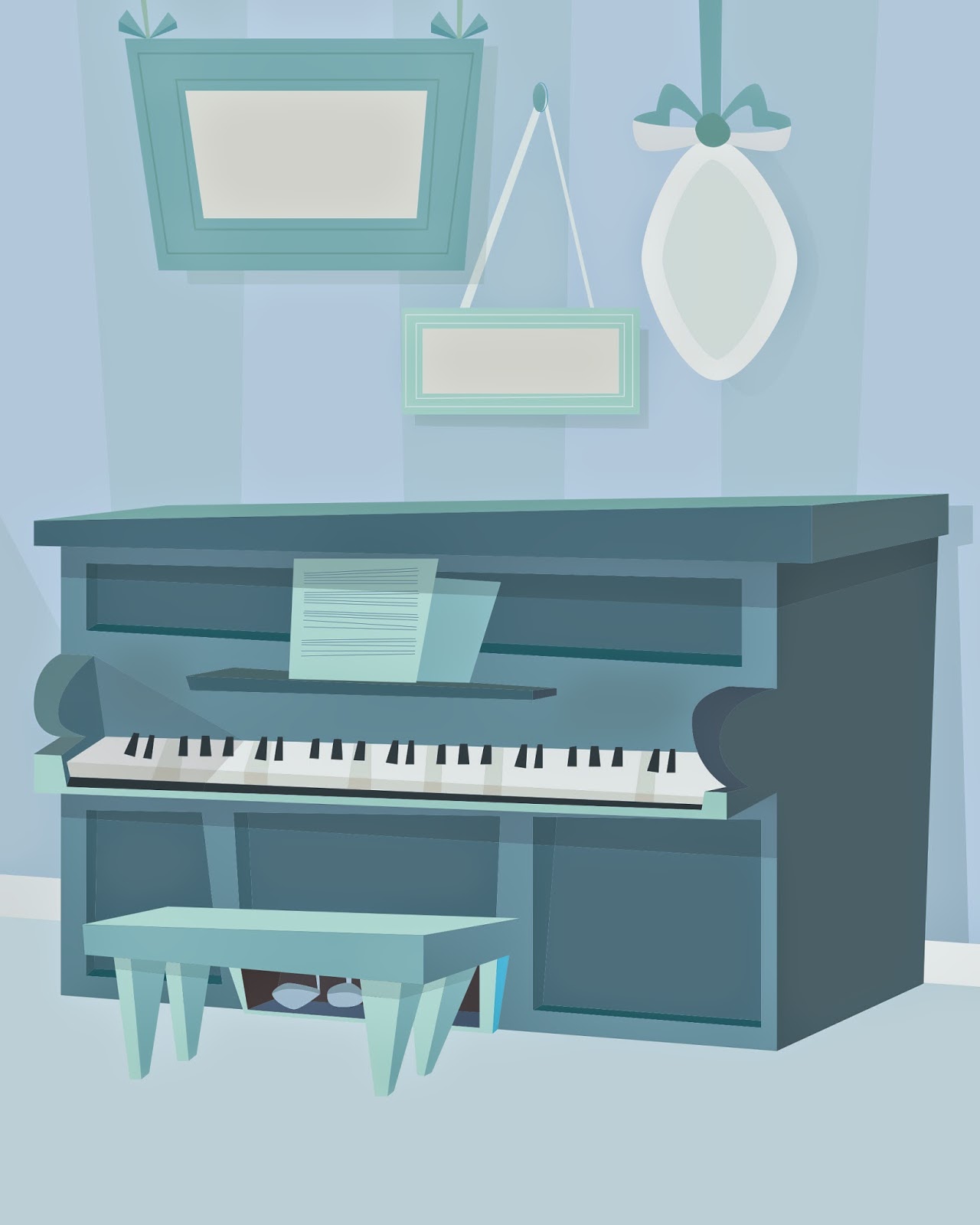 |
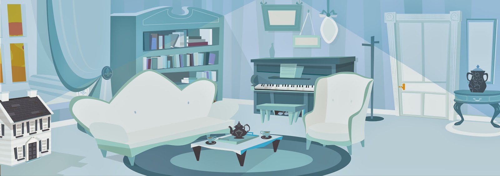
| The wonky blue piano that started it all off... |
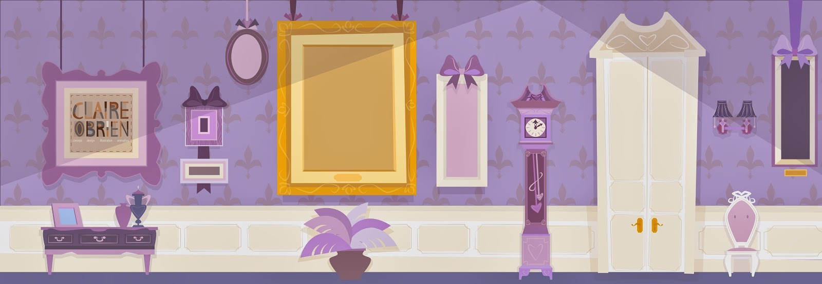
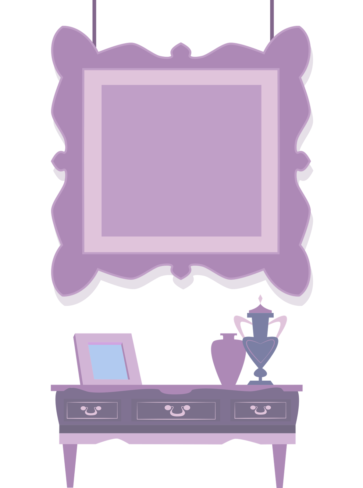
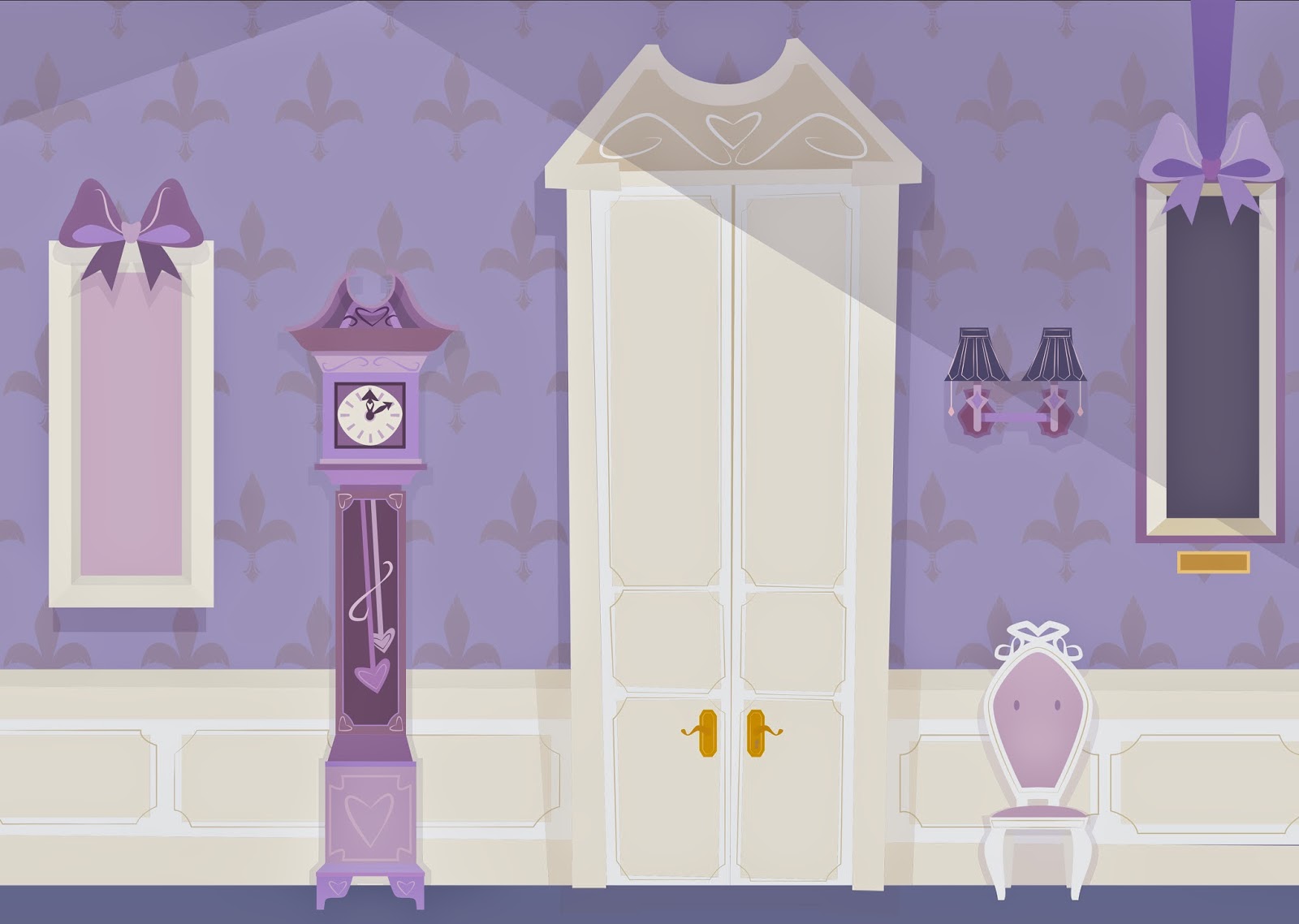
In the spirit of posting-up-slightly-old-work-and-pretending-like-it's-current-so-I-don't-get-such-massive-blog-guilt Guilt, here are some animation backgrounds I did for fun the past couple months. The first two are for a concept I dreamed up about five months ago about a colour-coordinated Russian Blue cat to while away the time while I was having a hard time. Making everything blue made me feel a lot better. So that's what I did.
 |
| Look Familiar? |
 |
| Here's why! |
So anyway…here they are! I still haven't written the full script but I thought it could be a fun little short. The idea is that Pru (the Russian Blue) only likes everything to be all one colour, and she hates it when they mix. So she tries to change everything up to make it all match. But that doesn't really work and yadda yadda yadda *meaningful life lesson learned* I don't feel that guilty about admitting that I didn't put too much thought into the story itself yet. I really just felt like drawing a blue piano and the room kind of built itself around it. I might finish it one day… but for now it goes on the heap of 'to-do' projects that live on my desktop. Sorry, guys.
This was before the era of the wonderful Cintiq baby I had in January, so I hadn't mastered the technique of texturing yet. This is just good old-fashioned flat-as-a-pancake vectoring, baby. Old school style (well, since 2005 anyway). Pre-January 2014, I did everything by photographing (not even scanning) a hand-drawn sketch, and then using my trackpad in Illustrator. You can imagine how long that took me.
Here, I was trying out some new things with the lighting (spotlights? In a Victorian house? Really?) which I know make not a lot of sense but I kind of felt like it. And everyone knows I always end up just doing the thing that I felt like doing anyway, so I thought I'd give it a go and see what it ended up like, for the sake of experimentation. I do like it, but trying to achieve any kind of volume or depth with 100% true vector art is always going to be challenging, especially when it comes to more rounded forms. In there, most of the forms are pretty straight but I wanted to mess around with perspective a bit. I have some friends who are graphic designers and when I showed it to them, they both said I could have pushed it further, made the forms a little more asymmetrical and wonky. I have to agree - so the next rooms I end up doing will probably end up being even more out there.
So now I'm in a better place (with a new job) I've kind of gone the opposite way and find myself getting less time to draw since I'm trying to be a productive member of society. I'm still fighting to get my portfolio together with all of my finished pieces, but I'm kind of limited to one or two days a week for now. Which means my drawing rate has significantly slowed down for a little while, at least. So…some oldies but goodies, right?
I really liked making things in this style. This is kind of where I started from before I went towards a much looser style (massively influenced by Mary Blair and Eyvind Earle) with this practice piece:
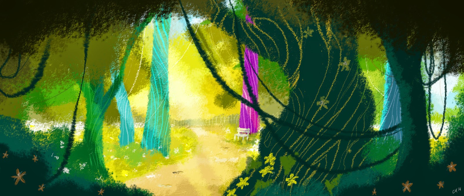 |
| Into the Woods |
And then I kind of fell into a hybrid way of working with this one, which I posted up before, for the medicine shop. I like mixing pixel and vector art, it's fun. I still haven't found my groove yet, because I'm experimenting with whether I want to add textures to my vector pieces, or whether I want to actually draw part of them in photoshop and part in illustrator, like I did with the one below.
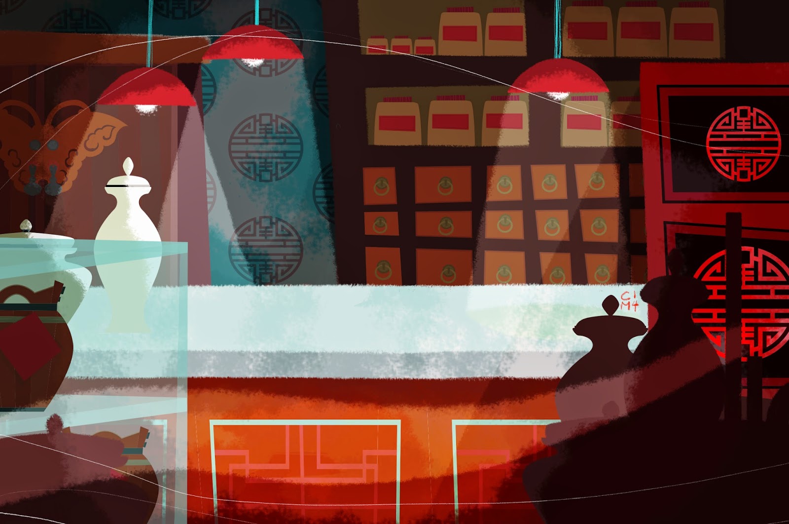 |
| The Medicine Shop Background |
I think both approaches can be fun, but it is harder to get the two to blend seamlessly unless you have either very strong lighting (cue the overhead lamps) or an overlying series of textures that will help to sort of 'push' the vector back so it doesn't stand out to much. The crispness of vector is something I absolutely love and hate all at the same time. I made the chinese medallions and background elements entirely in vector. (The medallions were inspired by some reference materials I found online). Then I added the atmospheric effects and texture in photoshop. The counter was originally vector too but I enjoyed the way it looked when I painted over it by accident so I decided to keep it that way. Yay for happy accidents!
I really thought I would have played the 'old stuff posted up again' card already here but I guess I haven't. So. Here you go. Hope you're having an Eggerific Easter! (I'm know, and I'm not sorry).
Sketch Book Saturday
Friday, 11 April 2014
It's been a busy time!
We had our annual musical production this week at work, and it was all hands on deck. I was in charge mostly of costume design for the principal cast, which was a lot of fun but time-consuming (and stressful). So unfortunately this week was so busy and I found myself so tired from all of the running around that I didn't have much time to draw. I feel my portfolio glaring at me from under the pile of books and coloured paper on my couch for being so unproductive.
Just so I don't feel too terrible, here are some old sketches I did in the summer just before my holidays. I coloured up one way back in January, but I'm not too crazy about it (it was my first attempt at using the tablet). My friend Ashley liked the first one so much I decided to gift her the original (since I insist on handmade presents for everything and am then officially the worst in the world at finishing them. Sorry Ash). Since I'm going to frame the originals and send them away to new homes, here are the (slightly fuzzy) scans. Have a happy Saturday!
 |
| Autumn Frolic |
 |
| Teddy Bear's Picnic |
Labels:
Adorable,
Children's Illustration,
Cute,
Frolic,
heart,
Little Girl,
Picnic,
Puppy,
Scan,
Sketch,
Sketchbook,
Sweet,
Teddy Bear's Picnic
Time for tea? I hope so!
Tuesday, 1 April 2014
Whew! Well that was a stressful evening of waiting up until 4am, anxiously glued to my computer and screaming blue murder at the maddeningly slow browser bar as it inched s-l-o-w-l-y forward. The good news is, I think I almost-maybe-not-quite-sure-but-possibly have achieved what it is that I set out to achieve. Which is, for now at least, top-secret. One of my pet hates is allowing myself to get over-excited about something only to have my hopes dashed at the last minute. So now I officially adopt an approach of what I like to call Realistic Optimism.
What I can share today though, is the good news that I got invited to Dribbble! Which probably means nothing to most of my friends but is kind of like a portfolio sharing version of twitter for designers and artists. When you're on it, you can like and comment on each other's work, and you can also look for jobs, etc. It appears to be a lot more in the vein of graphic design and web design than I thought, so it stimulates a different creative side of me, which I kind of like :D Also, you need to be 'invited' by an existing member of the community before you can post your own work or comment. I thought this might be a major problem since I didn't know anybody on it, but luckily a very gallant member who also happens to be on Behance (if you're an artist and you're not already, GET ON IT. I might make another post about that one on it's own, it's that good) invited me, and now here I am!
In honour of this, I made a little post-card with some of my cut-out designs from a previous background illustration I made, because let's face it - if you're Irish (who isn't?) you probably love tea.
Shall I put the kettle on? :)
 |
| Time for tea? |
Labels:
Alice in Wonderland,
Behance,
Dribbble,
Kettle,
Post card,
Tea,
Tea party,
Teacup,
Teapot,
Time for Tea
Work In Progress...
Wednesday, 26 March 2014
I started this painting after it began as something completely different, which is something that happens when I'm daydreaming (that means alot). I got to the background, and I ran out of steam. I'm still thinking about what to put in there. But I'm feeling a full-on background with some other characters in there. It might take me 6 months to get around to that though, so for the meantime, here she is. Godfairy and Cinderella mash-up. I call her: Tinkerella. Or something like that :)
Some close-ups of the face and hair details. These were a lot of fun to paint.
Subscribe to:
Comments (Atom)


