Wow it's been a couple weeks already since I've posted and I have no idea how that happened. Well, maybe. There's this post by Aminder Dhaliwal. I find her comics hilarious :D Yet another happy example of how my extreme super-sleuthery portfolio huntingness has been useful (thank you, Twitter).
So I'm still working on that top-super-incredibly-fanstastically-super-duper-wooper secret project that I can't talk about yet in case I jinx it. Let's just say it's not my first one, but I hope it'll be my first actually completed one. And it may or may not rhyme with 'look.' But that's it! That's all you'll get out of me. I am the Dobby of Secret-keeping. Wait. That probably wasn't a great example.
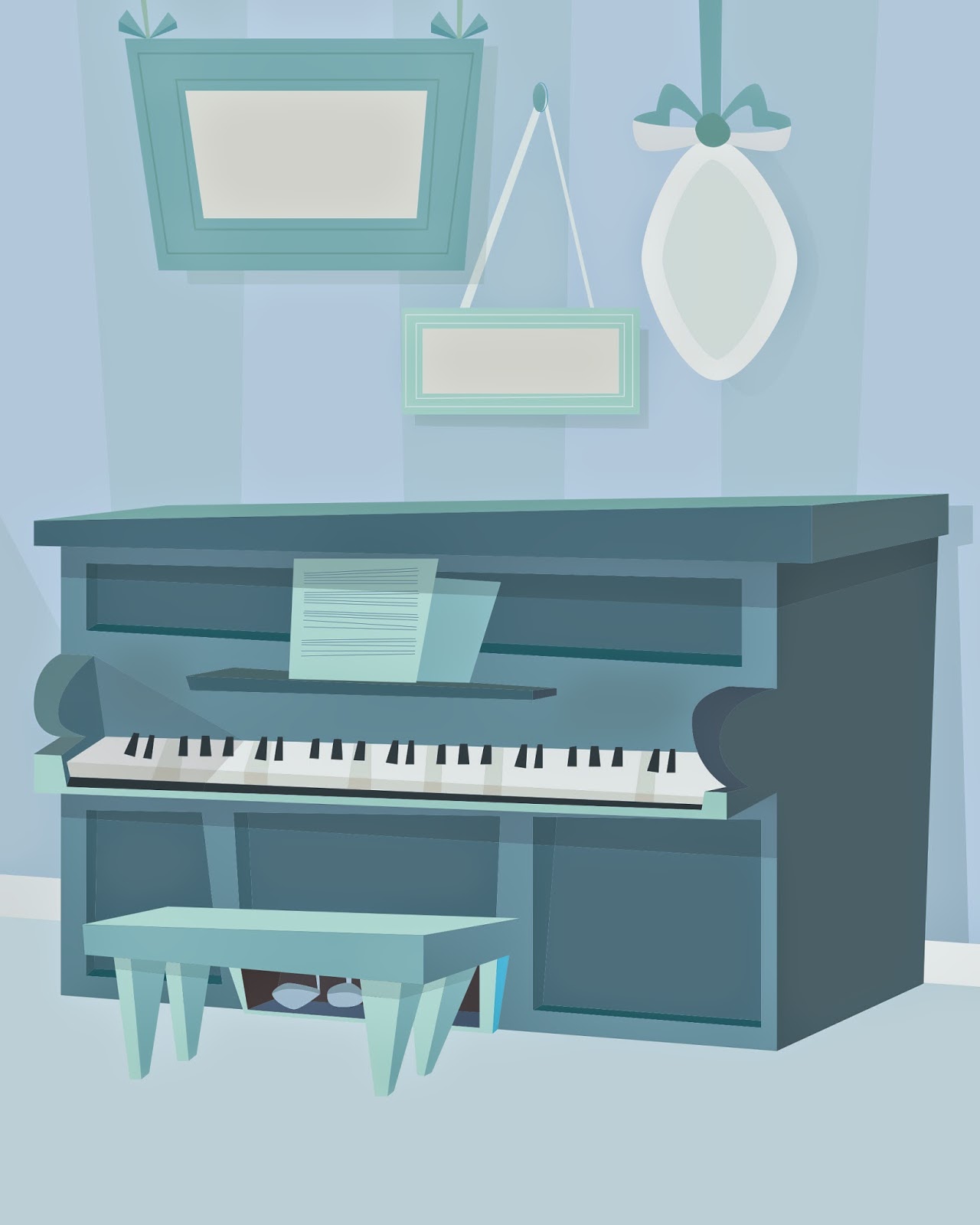 |
| The wonky blue piano that started it all off... |
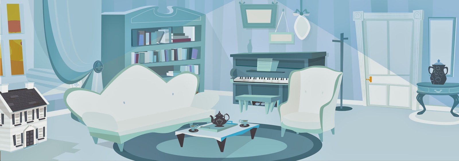
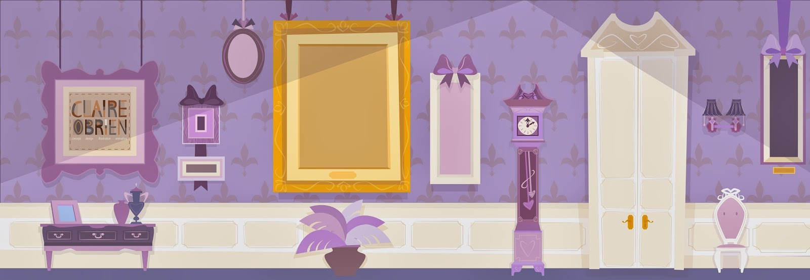
In the spirit of posting-up-slightly-old-work-and-pretending-like-it's-current-so-I-don't-get-such-massive-blog-guilt Guilt, here are some animation backgrounds I did for fun the past couple months. The first two are for a concept I dreamed up about five months ago about a colour-coordinated Russian Blue cat to while away the time while I was having a hard time. Making everything blue made me feel a lot better. So that's what I did.
 |
| Look Familiar? |
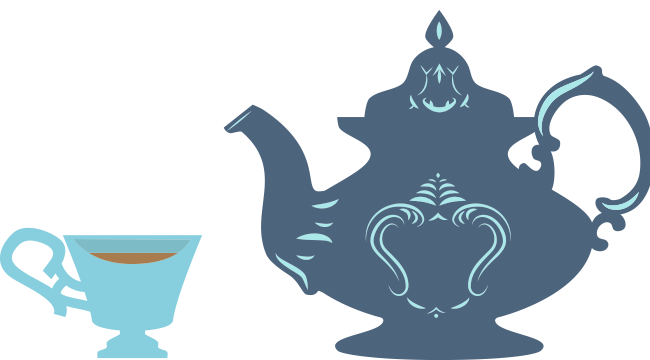 |
| Here's why! |
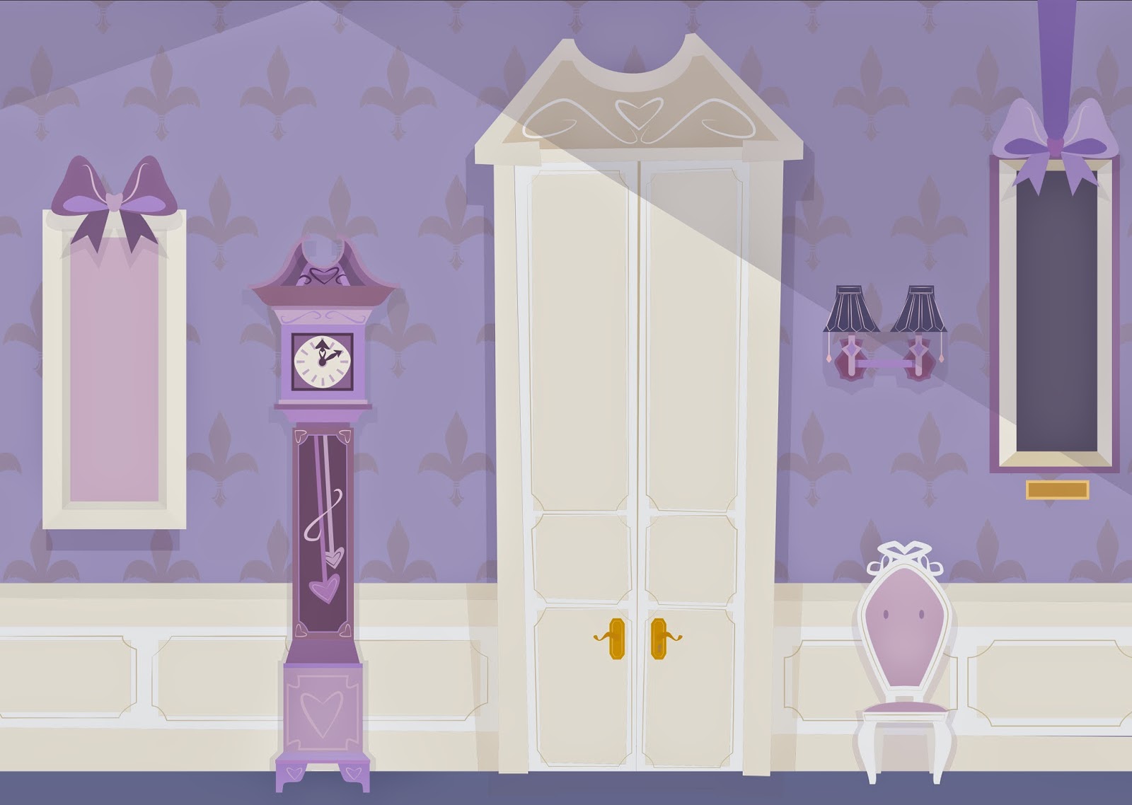
So anyway…here they are! I still haven't written the full script but I thought it could be a fun little short. The idea is that Pru (the Russian Blue) only likes everything to be all one colour, and she hates it when they mix. So she tries to change everything up to make it all match. But that doesn't really work and yadda yadda yadda *meaningful life lesson learned* I don't feel that guilty about admitting that I didn't put too much thought into the story itself yet. I really just felt like drawing a blue piano and the room kind of built itself around it. I might finish it one day… but for now it goes on the heap of 'to-do' projects that live on my desktop. Sorry, guys.
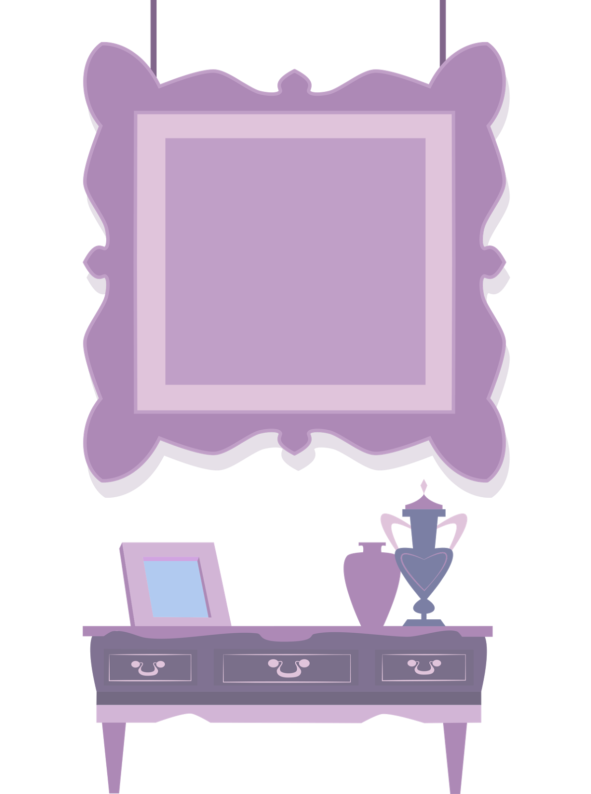
This was before the era of the wonderful Cintiq baby I had in January, so I hadn't mastered the technique of texturing yet. This is just good old-fashioned flat-as-a-pancake vectoring, baby. Old school style (well, since 2005 anyway). Pre-January 2014, I did everything by photographing (not even scanning) a hand-drawn sketch, and then using my trackpad in Illustrator. You can imagine how long that took me.
Here, I was trying out some new things with the lighting (spotlights? In a Victorian house? Really?) which I know make not a lot of sense but I kind of felt like it. And everyone knows I always end up just doing the thing that I felt like doing anyway, so I thought I'd give it a go and see what it ended up like, for the sake of experimentation. I do like it, but trying to achieve any kind of volume or depth with 100% true vector art is always going to be challenging, especially when it comes to more rounded forms. In there, most of the forms are pretty straight but I wanted to mess around with perspective a bit. I have some friends who are graphic designers and when I showed it to them, they both said I could have pushed it further, made the forms a little more asymmetrical and wonky. I have to agree - so the next rooms I end up doing will probably end up being even more out there.
So now I'm in a better place (with a new job) I've kind of gone the opposite way and find myself getting less time to draw since I'm trying to be a productive member of society. I'm still fighting to get my portfolio together with all of my finished pieces, but I'm kind of limited to one or two days a week for now. Which means my drawing rate has significantly slowed down for a little while, at least. So…some oldies but goodies, right?
I really liked making things in this style. This is kind of where I started from before I went towards a much looser style (massively influenced by Mary Blair and Eyvind Earle) with this practice piece:
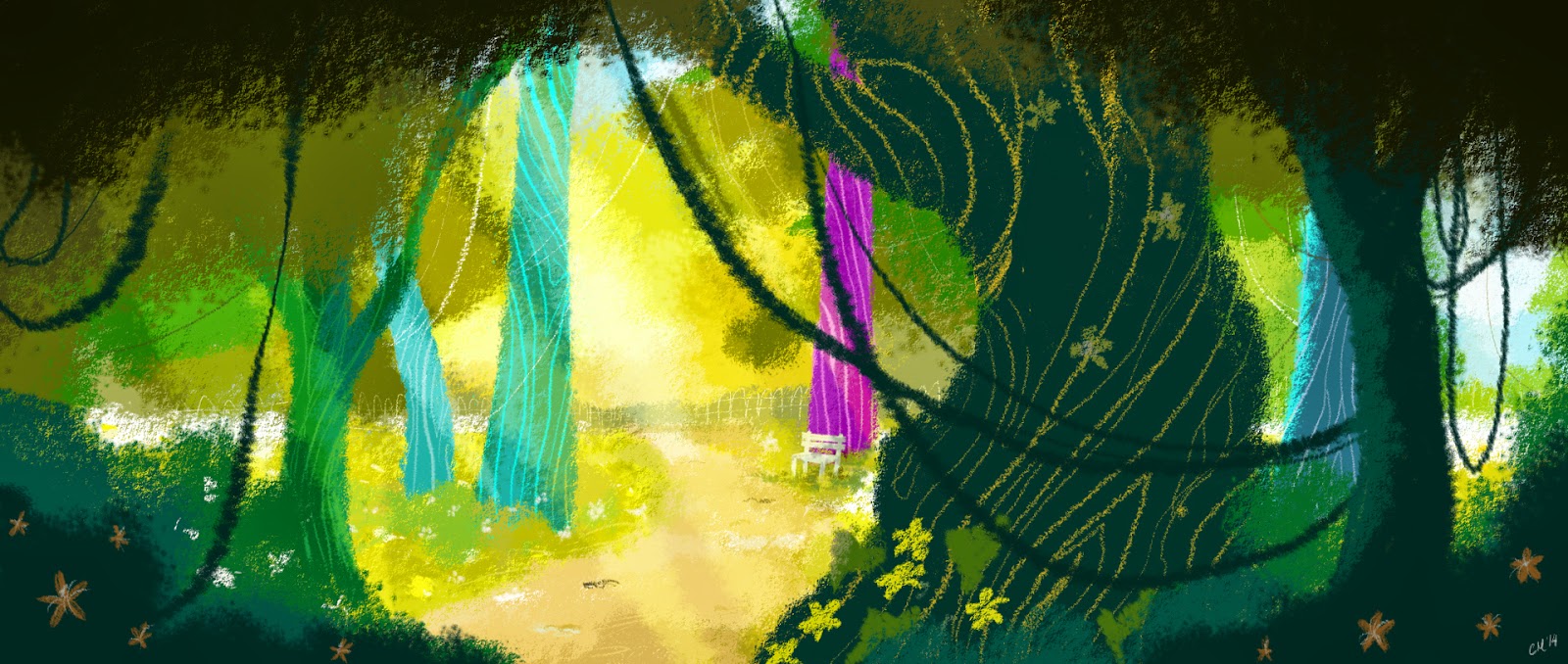 |
| Into the Woods |
And then I kind of fell into a hybrid way of working with this one, which I posted up before, for the medicine shop. I like mixing pixel and vector art, it's fun. I still haven't found my groove yet, because I'm experimenting with whether I want to add textures to my vector pieces, or whether I want to actually draw part of them in photoshop and part in illustrator, like I did with the one below.
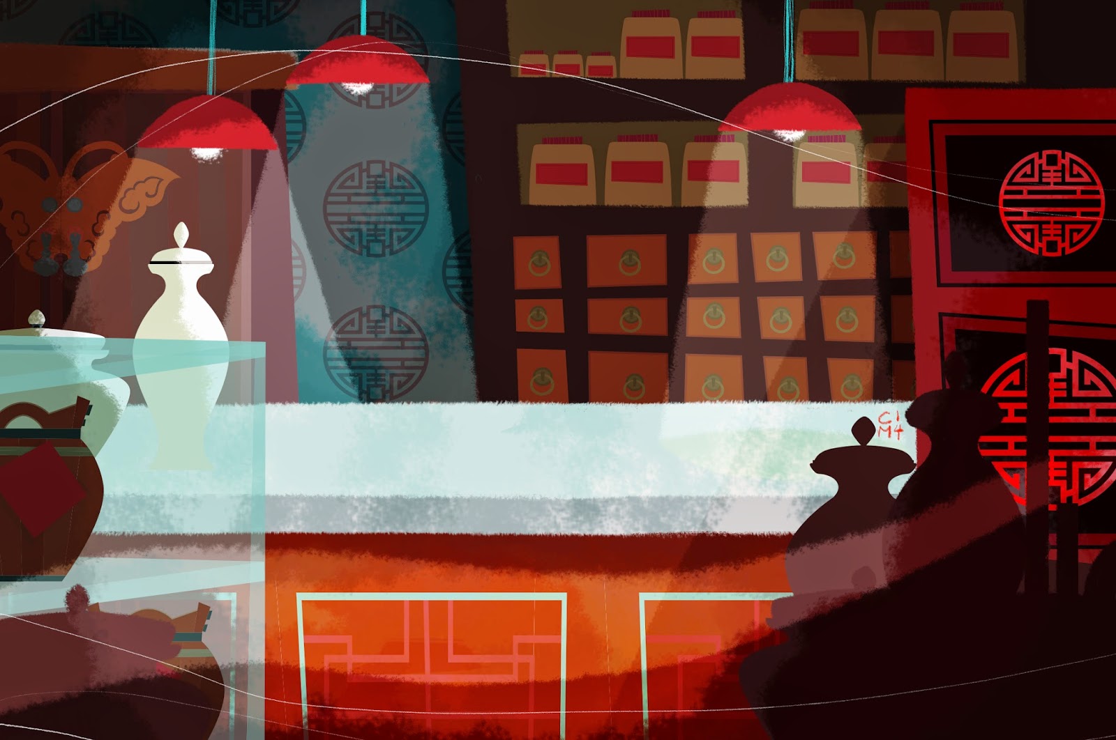 |
| The Medicine Shop Background |
I think both approaches can be fun, but it is harder to get the two to blend seamlessly unless you have either very strong lighting (cue the overhead lamps) or an overlying series of textures that will help to sort of 'push' the vector back so it doesn't stand out to much. The crispness of vector is something I absolutely love and hate all at the same time. I made the chinese medallions and background elements entirely in vector. (The medallions were inspired by some reference materials I found online). Then I added the atmospheric effects and texture in photoshop. The counter was originally vector too but I enjoyed the way it looked when I painted over it by accident so I decided to keep it that way. Yay for happy accidents!
I really thought I would have played the 'old stuff posted up again' card already here but I guess I haven't. So. Here you go. Hope you're having an Eggerific Easter! (I'm know, and I'm not sorry).



No comments